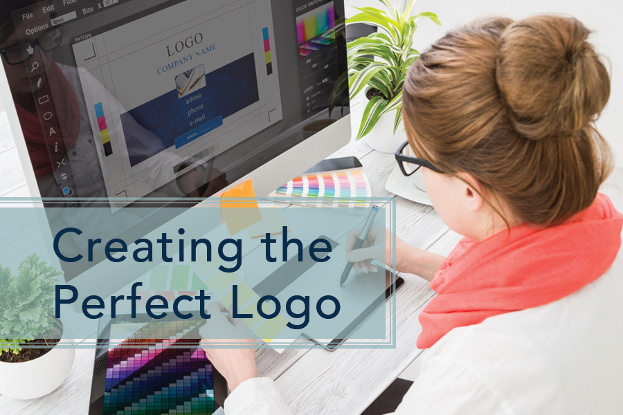
Last week, our blog focused on how to know whether or not your brand was ready for a new and improved logo. If you decided you were ready, then this week’s post is for you!
If you are reading this, then you already know that your company’s logo is a visual representation of your brand. A logo acts as a symbol of trust and familiarity for your clients and audience.
Whether you’re starting a new business or trying to improve your brand, the following factors are important to keep in mind when assessing the design of your logo.
-
Does it tell your story?
When clients see your logo and ask about your company name and logo, can you paint a clear picture of your brand in their mind? Does it align with your culture, and your “why”?
For example, when you look at The Markey Group’s logo, do you see an “m” or a wave in the circle? Spoiler alert: it’s both!
-
Is it appropriate?
Your company’s logo is an integral part of your branding, and should visually align with all visual assets. It should be an appropriate symbol of your company, but also feel unique within the industry to help you stand out among competitors.
(If you want to giggle, a quick google search of “inappropriate logos” will entertain you)
-
Keep It Simple
While complex logos might look unique and eye-catching, they will often end up looking cluttered and confusing, especially when used in smaller sizes.
For maximum clarity and a logo that can stand the test of time, avoid images or text with intricate details, and go for simple shapes and typefaces. You should also steer clear of subtle effects, such as drop shadows, beveling or patterns.
-
Color Palette
Each color carries a meaning and invokes emotion, creating an immediate impression of your brand. Studies have shown that all colors lead to certain reactions.
It’s also important to consider the intensity of colors. For example, soft pastels are typically used in beauty and health industries, while neon colors are used by brands who want to leave a bold impression.
-
Make It Multi-Purpose
Your company’s logo needs to work in a variety of different sizes and situations. Its quality should withstand being blown-up on a billboard, but should also be able to fit on a pen or tiny social media profile. To ensure that quality, a logo should be designed using vector graphics so that it is not distorted when resized.
-
Create Brand Guidelines
Once your logo is perfect, you want to maintain that status by creating brand guidelines that instruct your staff, partners, media, and any other third party on how your logo should be used. These guidelines can include exact CMYK or RGB color breakdowns for your logo, the amount of white-space that should be used around the logo at all times, and any ways in which your logo should never be used.
Your brand’s logo can have a huge impact on your business. The wrong logo can make your brand come off as unprofessional, assuming anyone notices you at all. A good logo will do just the opposite!
Ready to update your logo? Contact us to understand the process and kick things off!


